These are some of my case study & UI Designs. I can't share some others due to projects' NDA (Non-Disclosure Agreement). Thank you!
UI/UX Design
Project
Part-Time
Position
3 Months
Time
Cyber Army Indonesia is a cyber security startup in Bandung, Indonesia. I did an internship for 3 months as UX Designer & got promoted to part time for 11 months as UI/UX Designer.
This article basically more like a story when I had an internship and I will only explain the big scope on this project because I can't share the details due to the agreement.
So, me and my 4 friends in a team, we divided into two teams, UX Designer & UI Designer. I and my friend as a UX Designer, we make plans on our research on Cyber Army Indonesia's Website.
Here's the flow we use to Redesign Cyber Army Indonesia's Website
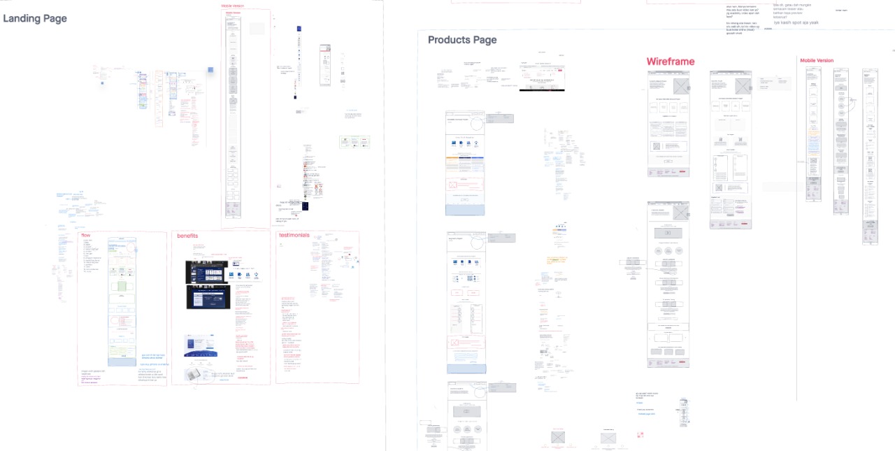
We use InVision App to brainstorm all fresh ideas and wireframes. The picture below is the real condition on brainstorming, discussion, and wireframing on a project we involved in.
We also made a report to share to stakeholders at Cyber Army Indonesia. We also have a lot of discussion to every decision we took.
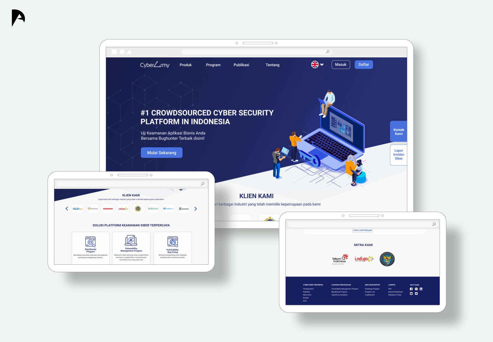
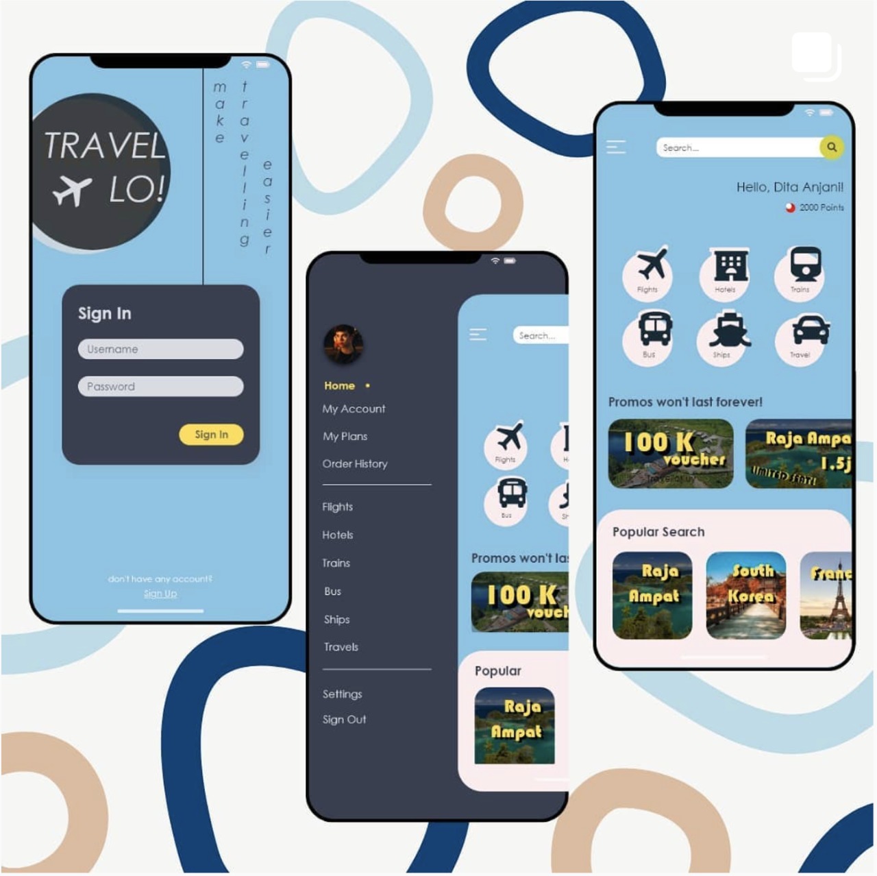
As we can see the picture below is some of the design solution using Figma given from the UX & UI Design Team to redesign the Cyber Army Indonesia's Website.

So that's all in short about this project and the design is being developed by the developer team on Cyber Army Indonesia. Thank you for reading!
Interaction Design
Project
Final Project
Position
12 Months
Time
To this date we’re writing this article, we are still in a pandemic era, in which we used to do everything at home or remotely. Maybe for most of the normal vision people get along easier with technology and others, but how about the visually impaired people? Even harder for students that have to study from home. This happens in Indonesia, where I live. Found the problems from one student in Surabaya who complained about how hard it is to study from home, both with technology and subject matter. That is why we make this a case study to be solved, from a technology perspective.
But, does it really become a problem for other people with the visually impaired too?
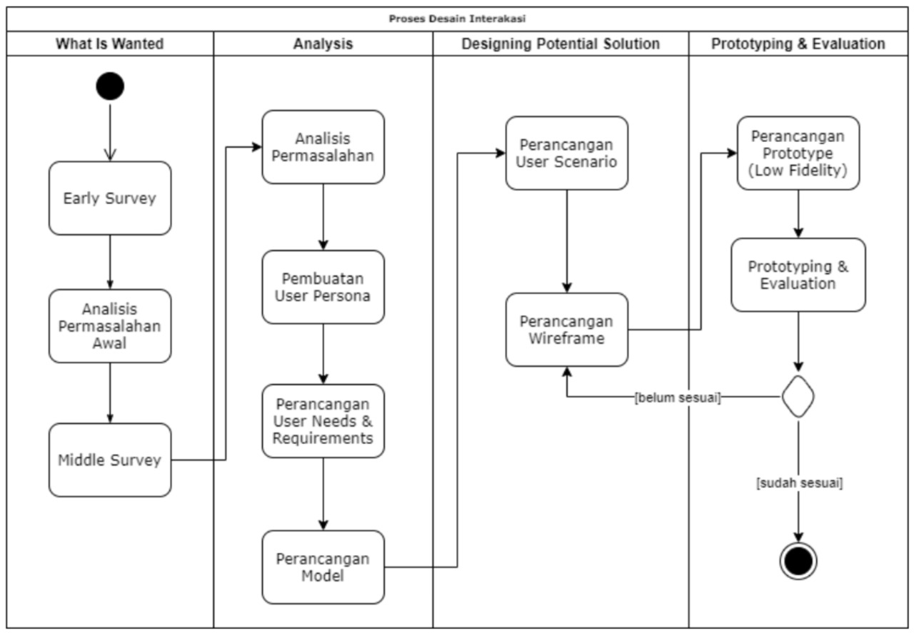
Before we going to the summary details, here is the workflow I used in this case study.
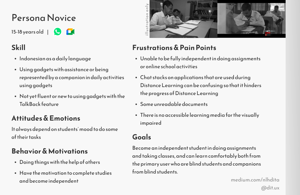
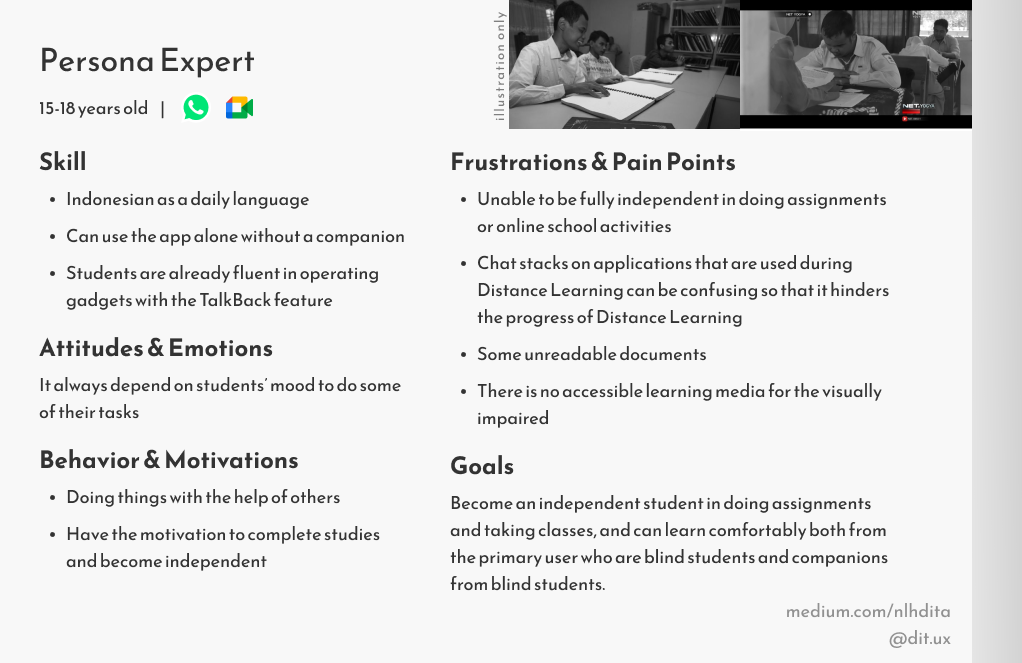
To answer the question on Introduction section, we conducted some early research on some students with visually impaired (both total-blind and low-vision) from a foundation in Jakarta. As the result, there are 6/8 students from the foundation in Jakarta who feel the same way as the student from Surabaya as we mentioned before. To be more convincing, we continued our research to a Special School in Bandung by interviewing and observing 12 students with the following 2 personas:
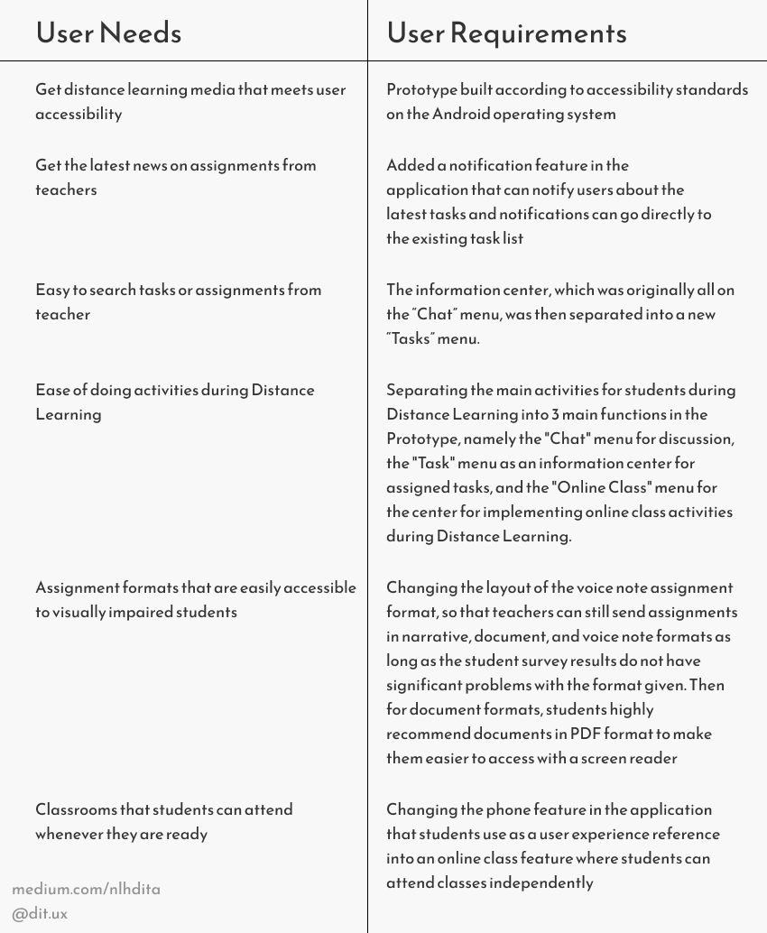
From the 2 personas above and held some research, we made a list of problems that students have experienced:
After we look through the problems and requirements, we made the mental model for this application, we found that we need 2 mental model.
The first one is mental model for telephone for students as we provide at the picture below.

The second one is mental model for the application itself.
.png)
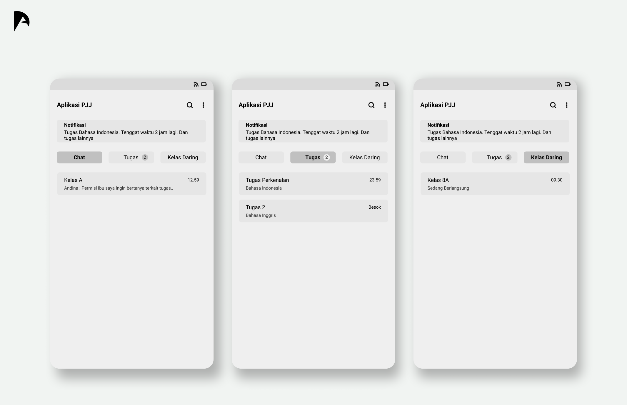
After analysis and all things considered, we provide the design solution from us to solve this case study.
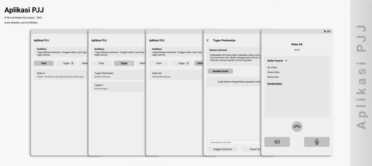
This is the design solution from us to solve users' problem. For the features we got it from the problems we found before such as:
Problem
Students have to scroll to find assignments and access these assignments, so if there is a buildup in the chat, it will be difficult for students to find assignments that have been given by the teacher through group chats,
Solution
So we decided to make a solution of this problem is to divide the menus into 3, the first one is basic for chats, the second one is for tasks/assignments, and lastly the online class menu.

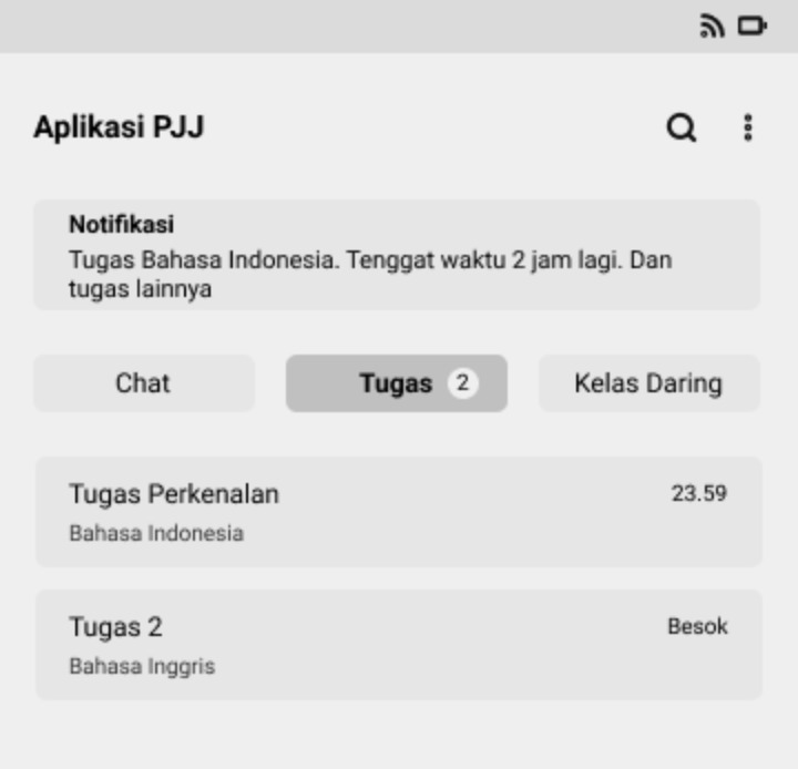
The reason is we don't want users have lot of efforts to find their tasks/assignments with scrolling chats or even we make menus on their room chat because users with vision impairment can't interact with menus in more than 3 level depth. So, we make 'opened menus' using tabs based on reasons above & users experience with WhatsApp.
Problem
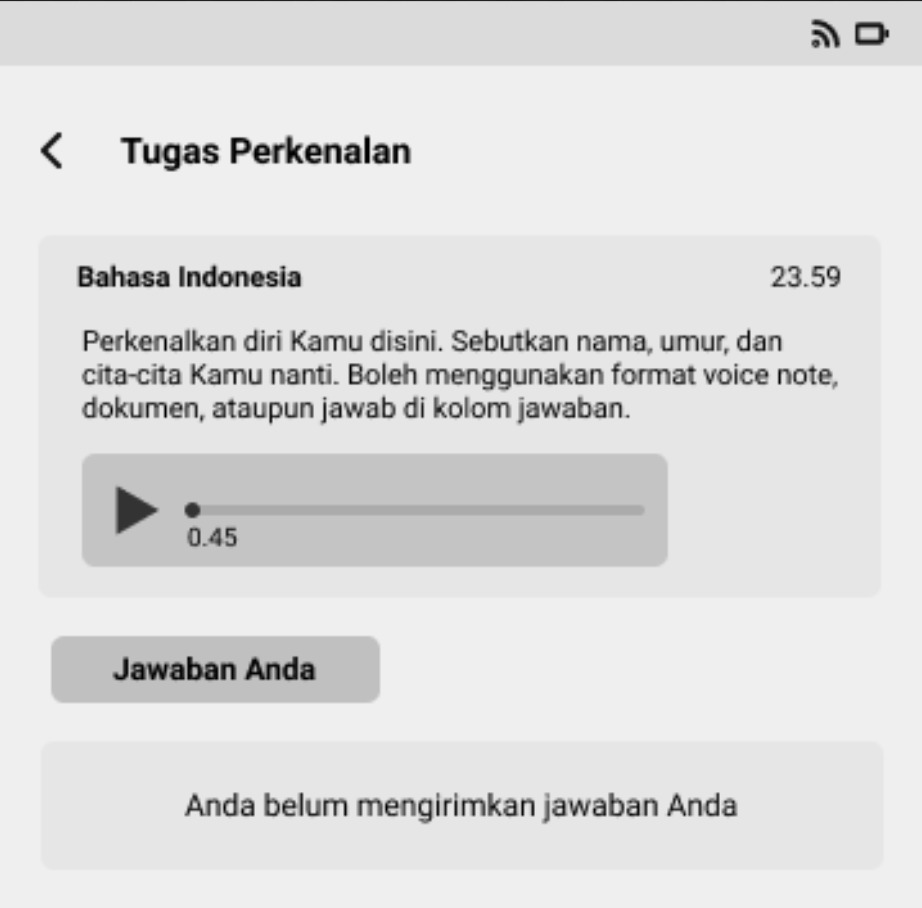
Students struggling to find the location of the voice note by scrolling through the chat.
Solution
To access tasks via voice notes, layout changes will be made so that voice notes can be accessed easily, so students don't need to struggle to find the location of the voice note by scrolling through the chat.
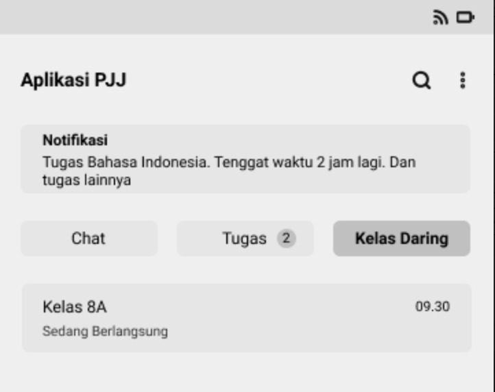
Problem
In participating in-class activities, there are difficulties experienced by students, namely the limited internet quota in attending classes, so that it can reduce the performance of distance learning activities. Not only that, other problems were also encountered by students, which when they were called via WhatsApp, sometimes students were not ready to attend PJJ activities so they missed it.
Solution
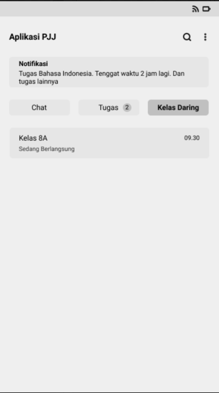
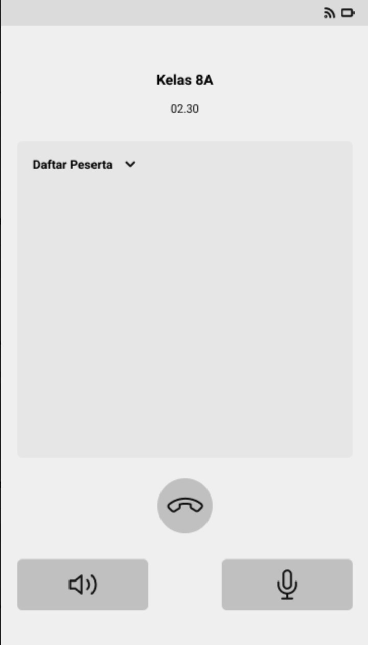
To attend the class flexibly, we provide new tab menu called "Kelas Daring" as seen at the design. We want to enhance the experience of students to feel like they entering the class onsite whenever they like, seeing blind users' behaviour too, which means the flexibility can be increased with this feature.
In the results of prototype testing carried out on the design of the solution that has been made, an assessment system has been carried out on the design of the solution using the System Usability Scale. After being calculated, the SUS Score on the Usability aspect is 86.25 which causes the results of this calculation to be in the acceptable category and the excellent category.
In this study, it can be concluded that the solution design that has been made based on the problems faced by visually impaired students in special schools can be said to be successful. Although the learnability score is still relatively low, this solution design can still be used because learnability can increase as the user experience increases in using the PJJ application.


Or you have a fresh opportunity for me? I'm only one chat away~